Ann Demeulemeester rarely needs an introduction, as one of the iconic Antwerp Six she and her fellow graduates became the faces of a burgeoning new wave of Belgian designers, paving the way for Martin Margiela and Raf Simons amongst many others.
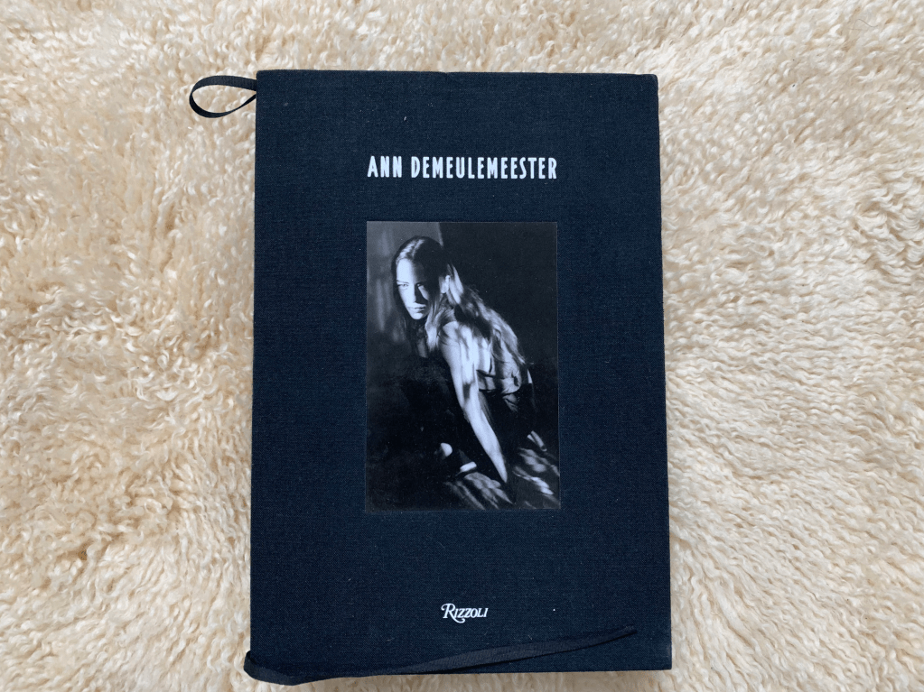
This book is a Rizzoli published retrospective of her work spanning from the early 80s until the departure from her namesake brand in 2014.
This isn’t your standard retrospective, with an introduction from legendary poet and muse Patti Smith, it dives straight into Demeulemeester’s life in a Waregem, in the Flemish region of Belgium. The region is known for flax production, which is of course used in the manufacturing of linen which the book is bound in. This seemingly small detail is the tip of the iceberg of how the construction of this book references the content inside. Smith’s introduction continues, with more anecdotes of how the designer came into contact with fashion, explicitly mentioning a black ribbon, which, not coincidentally, is used as the page markers for this colossal tome.
Throughout her career Demeulemeester has taken inspiration from many biblical references, such as the iconic Crown of Thorns motif used in S/S2010 as well as rosary necklaces spanning multiple seasons, so it’s no surprise that the book feels very much like a bible. It’s thick hardback and long ribbon page marks are synonymous with any kind of religious text, the wafer thin pages feel biblical, generating a tactile reading experience (even if there is a very present fear that every time one turns a page it’ll tear).
Much like the bible any attempt to sit and read the whole book in one sitting feels futile, it is simply exhausting to consume cover to cover, which makes sense, this is, after all a reference book more than a biography.
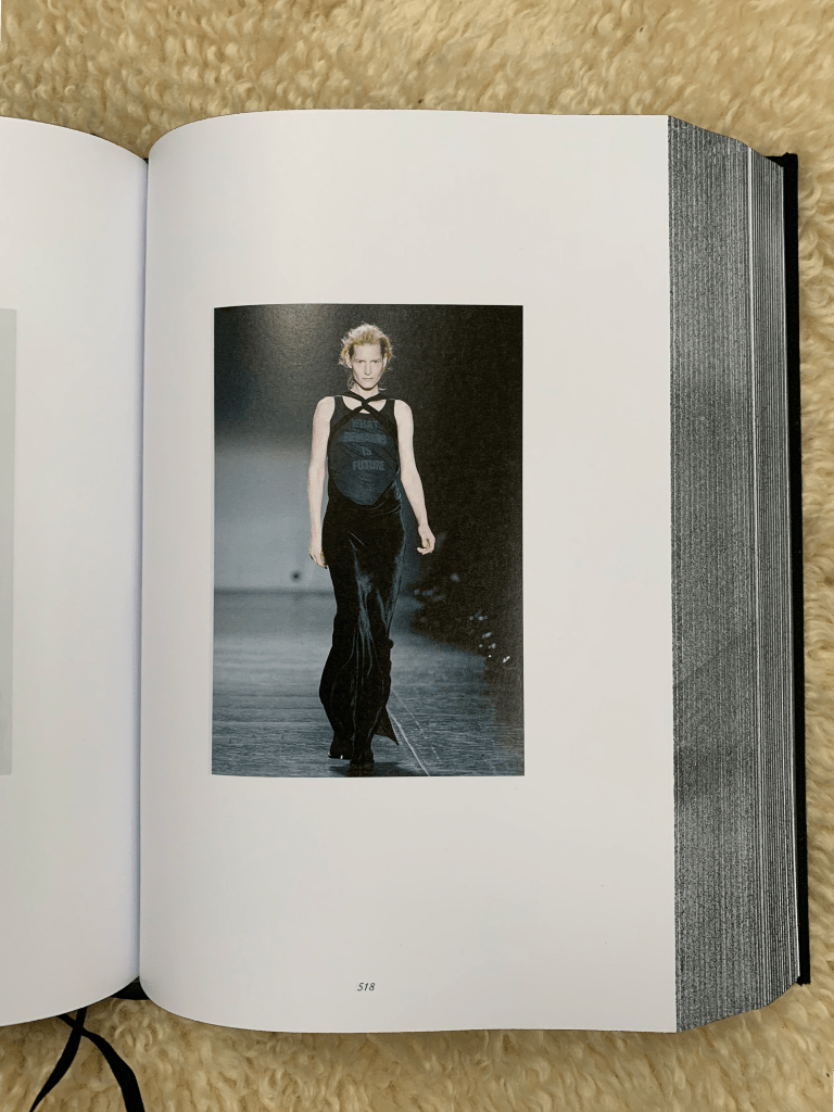
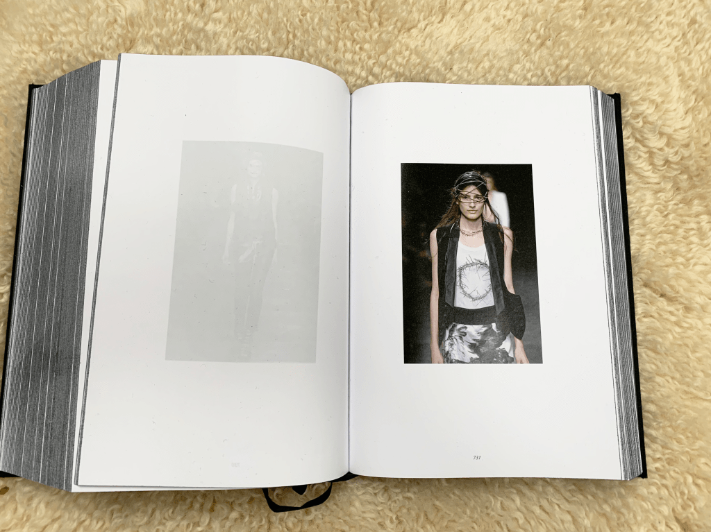
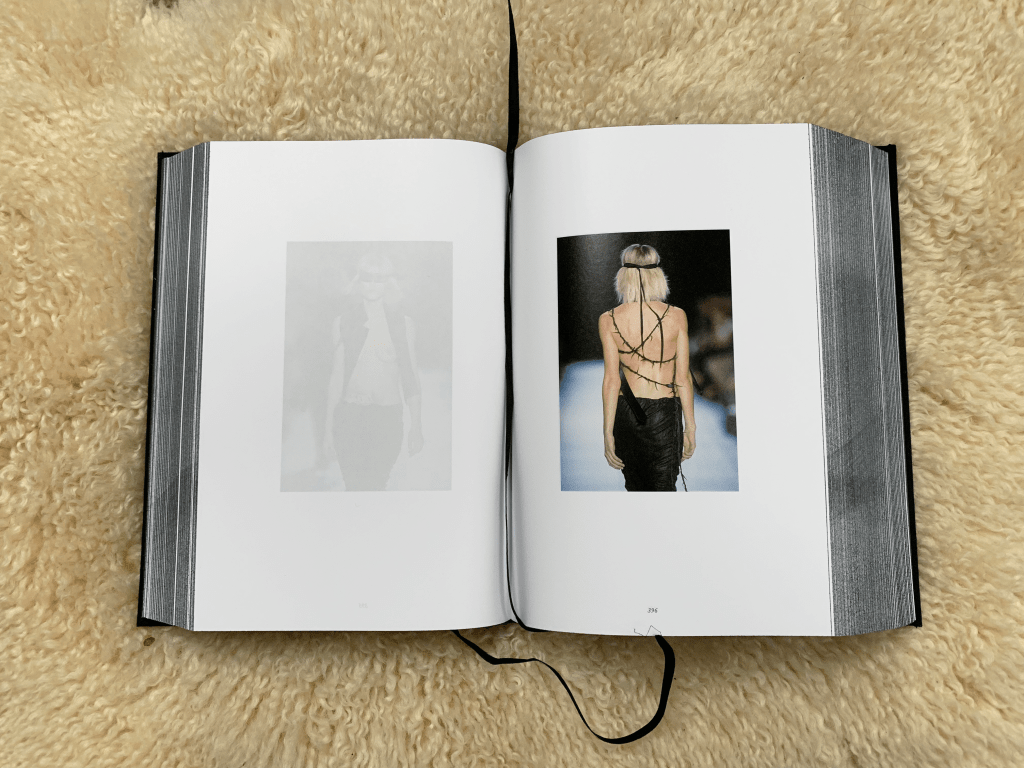
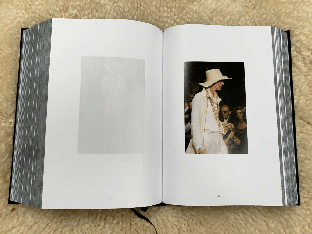
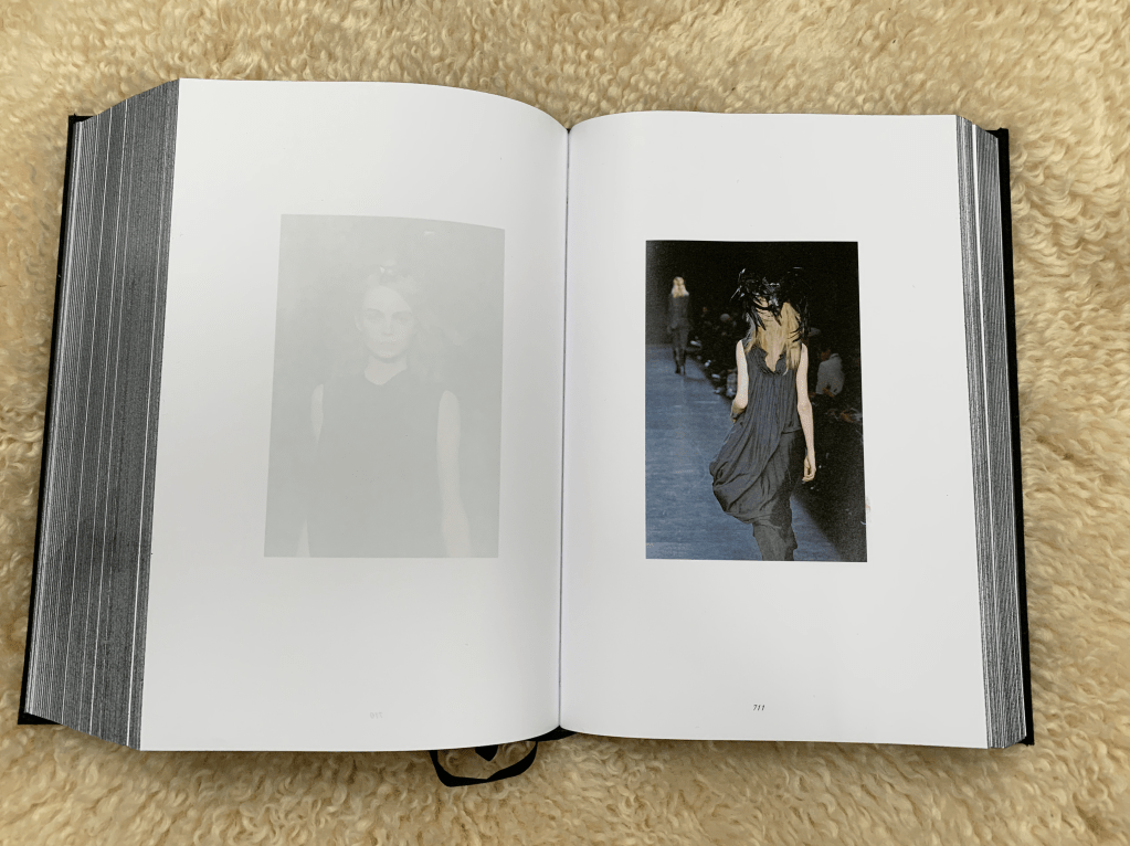
What makes this book so incredibly special is the fact that there is never more than one page used per spread and with that comes a sense of progression; The reader is always looking at the right hand page, never at the left, which leads to a bizarrely propelled reading experience, which while seemingly ironic for such an in-depth retrospective, cements Demeulemeester’s ethos of constantly moving forward, further proved by her use of the Patti Smith lyric “What remains is future” printed on T-Shirts.
At first the obscene length of the page markers seems ridiculous, but once the reader starts delving in they will realise that they have a heaven sent ability to keep hold of many pages at once, which again creates a beautiful, seamless fluidity which is only added to by the lack of text between seasons adding to it’s re-readability. This onslaught of imagery allows anyone to simply pick up the book and enjoy it at any time, open any page and you will be greeted by gorgeous photography of her many catwalk shows. But don’t dismay, even for the uninitiated, Patti Smith’s introduction provides enough context needed to appreciate and understand all the seasons without the need to interrupt the reader to explain the narrative behind every collection.
Overall this is a beautifully holistic retrospective, a true testament to how a publisher and designer can come together to create a piece of art in it’s own right. It is not some mere attempt to deliver reams of information, it manages to string together the personal history of an elusive designer, her work and her many references into a full experience that doesn’t patronise or compromise by pedantically explaining every single item featured. What is produced is a retrospective that avid Demuelemeester enthusiasts can truly sink their teeth into, yet isn’t too intense to the point that it would discourage those that are unfamiliar with a body of work as large as Demeulemeesters.
